1 Column Layouts
1 Column Layout Snippets gives you the choices of: Centered Content (with or without background), Content on Right, Content on Left, and Thin Rays Promo (Text + Button)
Demo
How To Use
Selection Options for Centered Content (with or without background):
- To edit the snippet, simply make your selections for the various options (padding, margin, etc.), then enter your content in the box marked 'Column 1'
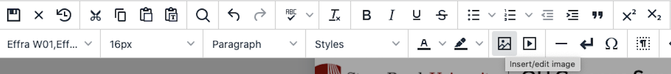
- Under Background Image, you can choose a background image for the snippet. To choose a background image, click on the image icon at the top of the screen like so:
 Note that you will be directed to a background images folder that contains approved
background images that are formatted appropriately. You will not be able to insert
your own background image.
Note that you will be directed to a background images folder that contains approved
background images that are formatted appropriately. You will not be able to insert
your own background image.
Selection Options for Content on Left/Right:
- The Layout Type field lets you choose whether the left and right columns will be split up into the snippet as follows: One Half | One Half, Two Third | One Third, One Third | Two Third, Three Quarter | One Quarter, or One Quarter | Three Quarter.
- The Top Border field gives you an option of Yes or No for including a top border for the left and right columns.
- The Bottom Border field gives you an option of Yes or No for including a bottom border for the left and right columns.
- The Border Between Columns field gives you an option of Yes or No for including a border in between the left and right columns.
- The Top Padding field gives you an option of adding padding between the columns and where the border would be, using the default padding, or using no padding.
- The Bottom Padding field gives you an option of adding padding between the columns and where the border would be, using default padding, or using no padding.
- The Top Margin field gives you an option of adding a top margin, using a default top margin, or using no top margin.
- The Bottom Margin field gives you an option of adding a bottom margin, using a default bottom margin, or using no bottom margin.
- The Extra Classes field is a developer only field.
- The Background Image field lets you choose a background image for the snippet. To choose a background
image, click on the image icon at the top of the screen like so:
- The Text Color field lets you choose a text color of default, black, red, or white as the text color for the snippet.
Selection Options for Thin Rays Promo (Text + Button):
- The Layout Type field lets you choose whether the left and right columns will be split up into the snippet as follows: One Half | One Half, Two Third | One Third, One Third | Two Third, Three Quarter | One Quarter, or One Quarter | Three Quarter.
- The Top Border field gives you an option of Yes or No for including a top border for the left and right columns.
- The Bottom Border field gives you an option of Yes or No for including a bottom border for the left and right columns.
- The Border Between Columns field gives you an option of Yes or No for including a border in between the left and right columns.
- The Top Padding field gives you an option of adding padding between the columns and where the border would be, using the default padding, or using no padding.
- The Bottom Padding field gives you an option of adding padding between the columns and where the border would be, using default padding, or using no padding.
- The Top Margin field gives you an option of adding a top margin, using a default top margin, or using no top margin.
- The Bottom Margin field gives you an option of adding a bottom margin, using a default bottom margin, or using no bottom margin.
- The Extra Classes field is a developer only field.
To the left of Content, there is a Background Images section. To choose a background
image, click on the image icon at the top of the screen like so:
Below Content, there is a section for Column 1 and Column 2. In Column 1, you can add some text to go to the left of your button. In Column 2, there are the selection options for the button.
Selection Options for Button:
- The Button Text field lets you choose a text for your button to display. If you don't see a choice on the menu that suits your cause, choose "other" and move on to the next field.
- The Other Text (optional) field lets you type in a text for your button to display if you choose "other" in the Button Text field.
- The Type field lets you choose the style of button you like: Red on White, Red on White (with arrow), Black on White, Black on White (with arrow).
- The Width (optional) lets you choose how many pixels wide your button should be.
- The Options lets you choose where your button should sit: Default, Center, Center on Desktop, Center on Mobile, Float Left, Float Right.
Above the selection options, you can type text to go along with the button.
To the left of everything, there is a field for a background image. To choose a background
image, click on the image icon at the top of the screen like so:
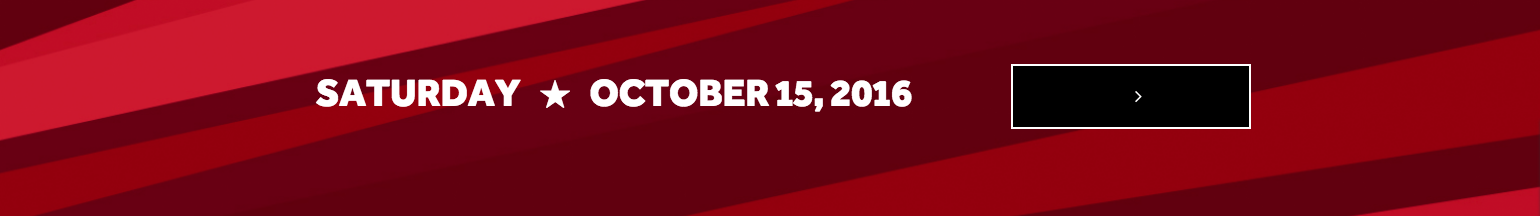
Example: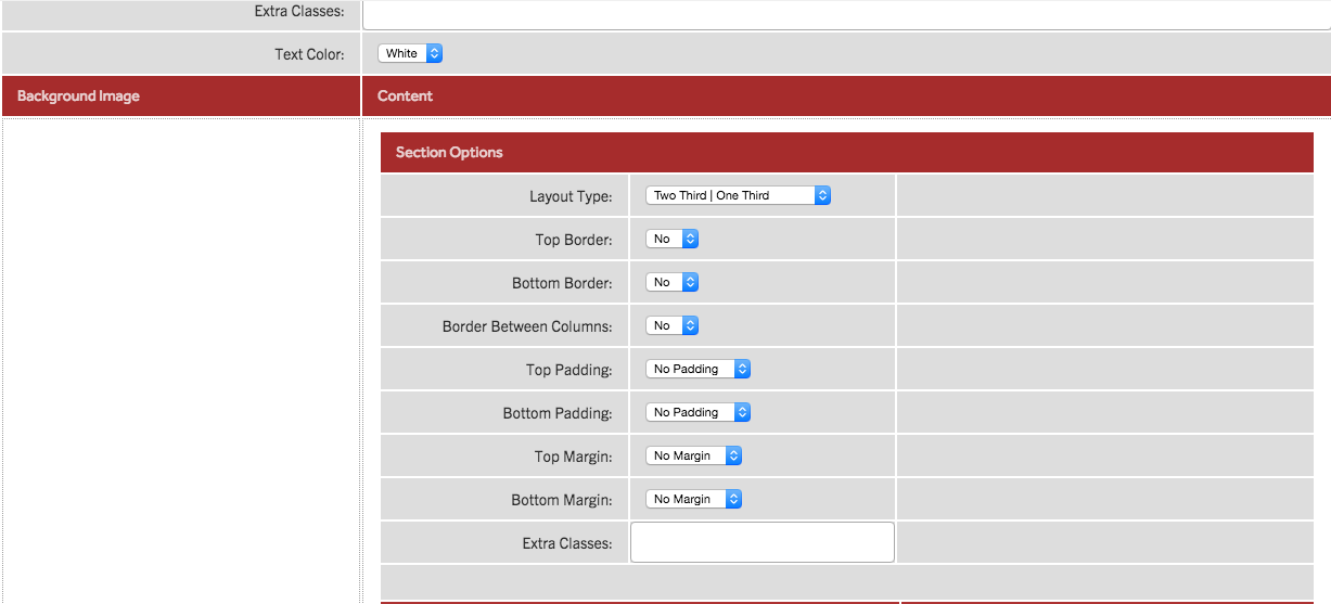
Preview: